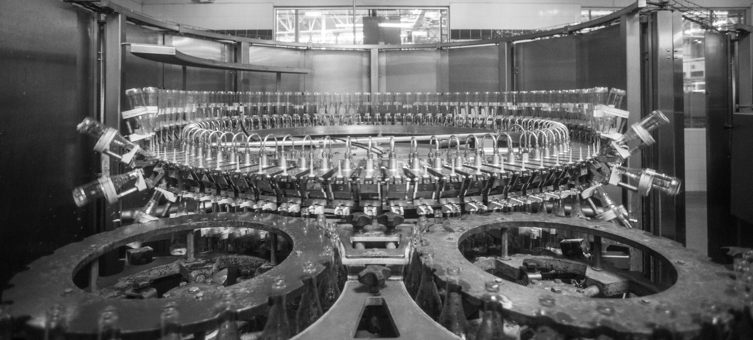
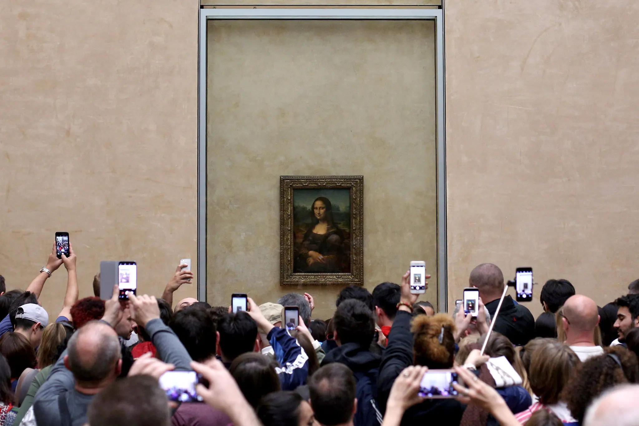
In the digital realm of today, visual design battles for attention in the algorithm-driven feeds, struggling to stand out in an ocean of uniformity. Templated, trend-heavy, and AI-crafted visuals flood this landscape, blending into a monotonous tide. Modern platforms reward consistency and speed, nudging designers to craft content that serves algorithms before people. Consequently, visuals are churned out to match these fleeting expectations, platform metrics, and client demands. The focus is swiftly produced, sleekly polished, and engineered for clicks. It feels mechanical, like a factory assembly line.
However, just like an assembly line, this practice often yields soulless designs that fail to resonate. It rarely connects to us on an emotional level, the heart of persuasion, which builds trust and memorability (Chitturi et al., 2008). While optimized for clicks, such designs often sacrifice user-friendliness, leaving audience frustrated. Metric-driven design, which focuses on chasing click-through rates or dwell time, reduces emotional resonance and fuels user distrust (Birecka, 2025; Gachko, 2024).
Audiences are growing tired of generic content that blends in. They yearn for authenticity, emotion, and intention that reflect the brand’s integrity. They praise brands that feel “human” by connecting through humor or sharing relatable stories.
Take, for instance, the marketing world, where campaigns rooted in cultural relevance or emotional storytelling, like Patagonia’s environmental focus, or Duolingo’s unhinged humor, resonate to us more deeply than generic ads ever could.
Today, this means grounding design in real values rather than microtrends. Surface-level design is not enough anymore. To be memorable, visual design must feel human, alive, not manufactured or templated.
Once, “good” design meant pixel-perfect visuals that clearly conveyed a message, and that was enough. But that bar has shifted. The audience is now becoming more sensitive to how they’re treated in digital spaces, they crave more. Today, people look for meaning, and if a visual feels manipulative, exclusionary, or empty, it falls flat, failing to connect (Birecka, 2025).
“A color contrast is not just an accessibility checkbox; it is a statement about who deserves clarity. A line of microcopy is never “just text” — it is a decision to reassure, to exploit, or to respect.”
Jagna Birecka, 2025
Yet, success metrics tied to attention, data, and dollars can trap even well-meaning designers in unethical practices. Truly good design must weave in ethics and emotion into overall experience that makes users pause, feel, and remember.
Good design is human-centered, not templated.
Jagna Birecka (2025) illustrates this beautifully, emphasizing that the future of design lies in keeping the “right questions” alive, about what should be designed, for whom, and why, rather than just solving problems efficiently. Rather than focusing solely on efficient problem-solving and checking established boxes, design must prioritize purpose and humanity at its core.

References
Birecka, J. (2025, Jul 11). Design in a world of change: Why ‘old’ UX is not enough anymore. Medium, https://medium.com/design-bootcamp/design-in-a-world-of-change-why-ux-is-not-enough-anymore
Chitturi, R., Raghunathan, R., & Mahajan, V. (2008). Delight by design: The role of hedonic versus utilitarian benefits. Journal of Marketing, 72(3), 48–63. 10.1509/JMKG.72.3.048
Gachko, E. (2024, Mar 28). The impact of emotional design on user engagement. Designlab, https://designlab.com/blog/impact-of-emotional-design-user-engagement


